


The vast majority of tattoos are ill-conceived, badly executed, poorly placed or fated to be dated within a decade. They carry backstories that can magically enhance their impact or instantly compound their stupidity. But it doesn’t matter: Unlike any other art form, this one is intended to please just one person: the owner.
It begins to matter, however, when they’re presented to the public, inviting response and critique. But how to critique them? As fine art? Fashion? Design objects? There’s no established framework. And thanks to the art world’s confounding resistance to this marvelously dynamic medium, so packed with potential as a graphic challenge on a unique, permeable, living canvas, it hasn’t happened there. More often tattoos are presented in books, with text, where they can be pinned down and commodified. But in this context, they’re subsumed (or at least framed and shaped) by yet another medium—photography—and lose something when they cease to be living art forms.
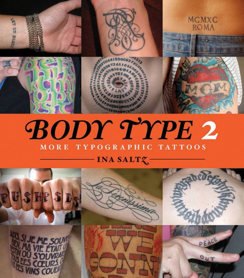
Design professor Ina Saltz sidesteps some of these obstacles by publishing books on typographic tattoos intended to be “read.” Like its 2006 precursor, Body Type: Intimate Messages Etched in Flesh, Saltz’ Body Type 2: More Typographic Tattoos features largely two-dimensional designs worn by tattooees with a comparatively high degree of visual sophistication (many work in printing or graphic design themselves). By tracking this growing trend, Saltz has not only found a fascinating subculture, but also cultivated it: Some of the tattoos in this book were directly inspired by her first volume.
Saltz attributes the rise of typographic tattoos to computer literacy. “I believe that we are now firmly ensconced in a new ‘golden age’ of typography,” she writes in the introduction to Body Type 2. “… Young designers are excited by the vast panoply of typographic forms (about 90,000 by some rough estimates). The ease of acquiring digital typefaces, and the ability to create their own typefaces, [has] encouraged experimentation and eclectic choices. This has inevitably been reflected in the typographic tattoos abounding in the youthful population.”
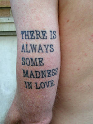
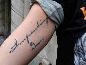
The book is organized by themes (“Love & Tribute,” “Poetry and Literature,” “Faith and Protest”…), but could easily be broken down by placement. The back risks becoming a signboard if too many words or too large a typeface appears on it. Couched in elegant script, any phrase or sentence can look beautiful spiraling around an arm, necklacing a chest or circling an ankle. No matter how carefully words are inked on a forearm, they will look crooked applied in a straight line over the muscle. The man on Page 28 who wears “wonder” on his upper arm, precisely where a lover would lay her head, is the last romantic, except, maybe, for the wag on Page 29 with the “you are here” inscribed in Bickham Script over his heart.
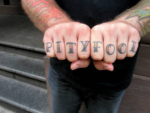
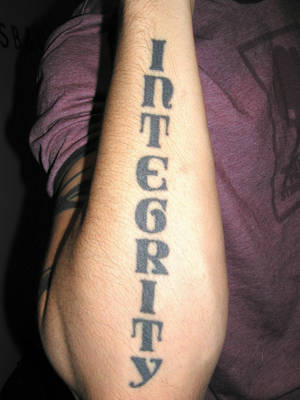
Phrases and letters arranged vertically inevitably look stiff and ugly on calves, and it takes a certain plodding literalist to distribute letters one by one across fingers, like the woman who wears “Hopeless” on the top of her hands and “romantic” on the flip side. (Still, the painter with “optimist” artfully splashed across his—or her?—hands, without regard for finger spacing, made me question my theory that only knuckle-draggers letter their fingers.) But the lowest rung on the placement ladder belongs to inner-lip enthusiasts. They not only mount their tattoos on a body part no one wants to see, but also look moronic every time they pull their lips down to reveal them. I don’t care how much you like Obama, the president does not want his name swimming in your saliva.
Tattoos, and especially language tattoos, and especially typographic tattoos, rely on words not only for content, but often for justification as well. And that’s okay: Tattooing is a narrative art; the explanatory stories are part of the package. Saltz includes them in captions under the photos.
Sometimes the narrative helps: When two friends named Luv Joy and Joy Luv were reunited after a nine-year separation, one tattooed “Luv” on her right wrist, the other got “Joy” on her left wrist. Now they complete each other.
But sometimes it hurts. It’s hard to say who made the bigger mistake on Page 36: the guy who let his girlfriend tattoo his nickname, Snidely, in large type running down the back of his calf days before they broke up, or the girlfriend who botched four letters in the spelling. The tattoo (“Snyvley”) only looks worse for this reminiscence.
A backstory can also upstage the image altogether. This is where tattooing starts to look a lot like conceptual art: The telling, in words, of the motivating idea can account for a large part of the artistic experience. By the time I finish explaining the next one, for example, you will have processed the concept and enjoyed the tattoo without even seeing it. You don’t need to see it to appreciate it, which is ironic in light of its content: A Christian woman chooses the Biblical verse “One thing I know; once I was blind, now I see,” and positions the letters in the shape of an eye chart, proceeding from top to bottom. The physical tattoo is a mere afterthought to her punning idea; and the fact is, the story sounds better than the tattoo looks.
Saltz calls the graphically-conscious designs in her book “intellectual tattoos,” and it’s true that most of these people, Snidely notwithstanding, put a lot more thought into their tats than the average yutz wearing skull or flower number 999. But the success of typological tattoos is contingent on an artist’s technical skill—much more so than for less-stylized designs. The Bronx artist Tattoo Seen, for example, who reproduced Roy Lichtenstein’s “Crak” on a forearm, did a spectacular job of scaling it to size and following Lichtenstein’s fluid line. Stephanie Tamez (a former graphic designer) emerges a superstar in these pages, performing multiple miracles, including inking a Nietzsche quote, in reverse, in a perfect circle—over a rib cage.
The Details

When she began documenting typographic tattoos, Saltz set out “to understand why specific typefaces had been chosen, and as a designer, to comment on the appropriateness of the choice and the success of its execution.” I was looking forward to her professional response to the tattoos in this book, but she offers none, even in the introductions to each section, which focus almost entirely on content (“musical marks isolate and elevate a special moment in time …”) or tattooing in general (“the urge to create is a powerful one, celebrated in many tattoos”). Her observations are meatier in sections that focus on forms, like numbers, typography and ambigrams, but still don’t directly address the work she presents. Equally frustrating, many of the typefaces in these tattoos go unidentified—a glaring oversight for a book devoted to typography. Body Type chronicled many more, focusing as much on tattoo composition—including letter, word, and line spacing—as accompanying narratives.
Still, as a curated collection, Body Type 2 traces a fascinating trend at a watershed moment, when designers have blown open the doors of possibility in unexpected new ways. It may not expand tattoo discourse, but it does raise the aesthetic bar. And to her credit, Saltz follows designer David Carson’s dictum (which inspired a lovely tattoo in these pages): “Don’t mistake legibility for communication.”


Previous Discussion: