JW Caldwell: Cognitive Dissonance Through January 31, by appointment. Rise at Holsum Lofts, 241 W. Charleston Blvd. #130, 702-845-7907.
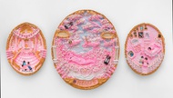
Walk into Rise Gallery and whammo! The expertly hung and curated show, Cognitive Dissonance, vibrates with coherent art cred and proves that JW Caldwell can paint. But what gives the show its wallop is how deftly Caldwell leaps across the word-image divide. The text in these 37 works does more than simply caption images: The words become the image itself.
For example, the small-format diptych “A Brief Rumination on the Expediency of Deterioration” presents a cockroach and the word “bad” on the left, and a herd of nine roaches and “worse” on the right. (The missing “to” in “bad to worse” is implicit in the “two” works-on-paper.) The words—painted in a rounded, lower-case cursive—mimic the roach trail that continues from one work to the next, uniting the textual elements in a single toothpaste-ish stream with subtle fecal associations. Text becomes image, and the image recalls the fact that roaches defecate chemicals to communicate—their trail is their language. The red color of the cursive script piques the creepy emotions associated with the insects, while the muted splotched ground humorously suggests the messy, and scatological, dimensions of eating and art-making.
“Straight to Voicemail,” too, simultaneously delivers and undercuts its message with wit. In this medium-format canvas, “love is a lie” is painted in an all-cap graffiti font dominating the canvas. The hearts-and-valentines colors—muted fleshy pink and bruised mauve—are at odds with the damning content. The cracked and decomposing stone letters combined with the faux-marble backdrop suggest the relationship is in ruins. Yet in the “Voicemail” foreground, a pink, pudgy kitty—the queen of memes—appears ready for a make-up cuddle. Or is it? The cat image partially obscures the letters in the word “lie,” drawing attention to the cover-up and implicating itself in the ruse. Given that the message is going “straight to voicemail,” the cat might symbolize abandonment, which would account for its slightly startled expression.
While Caldwell’s Disney works are perhaps less accomplished, the pieces in which text transforms into image lend themselves to a rich array of tongue-in-cheek interpretations. Both the comic mountain sheep series and the shark series feature letters whose shapes vie with legibility for the upper hand; both series are painted to look like prints, emphasizing the tromp-l’oeil current in the exhibition. Overall, the works in Cognitive Dissonance expose disconnects between words and their meanings by subverting the mainstream canon of representation. In doing so, they draw attention to the way pop culture unconsciously permeates our thoughts. All the more reason to make a conscious decision to see the show before it closes.

