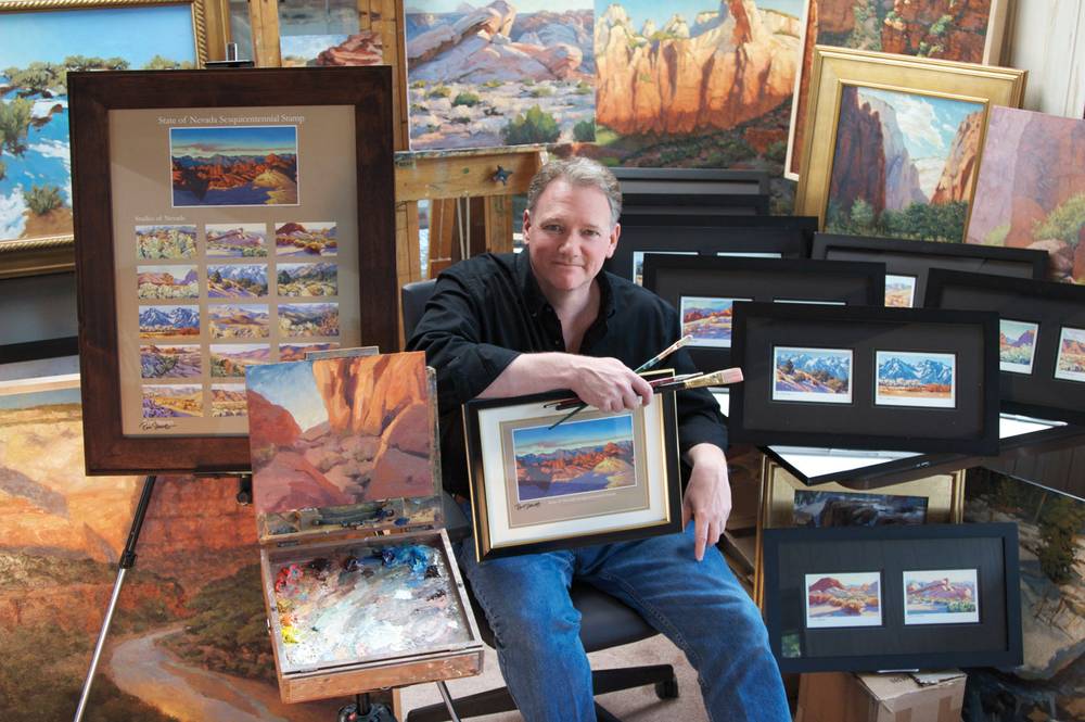
Had the question been asked of most artists, I imagine the typical interlocutor would have taken great offense. Yet it felt right to wonder about the apparent résumé contradictions of the man chosen to render the image for a U.S. postage stamp that will launch this week in honor of Nevada’s 150th year of statehood. After all, Ron Spears is a serious person, a university professor with a master’s in fine art who also is responsible for illustrations on dozens of casino games as well as the Harry Potter trading cards.
“It seems to me that it’s unusual in the art world to have someone willing to connect the artistic with the commercial,” I said. “I mean, Van Gogh would never have painted images for a slot machine, right?”
Spears took the analogy as a compliment.
“Oh, thank you!” he replied. “I just love art on all levels. I love the commercial aspect. I like the problem-solving of it. I like fine art; I like to paint for the joy of painting.”
In that sense, the artist selected by the U.S. Postal Service is, in fact, the embodiment of something vital and elemental about being a Nevadan. He is both a scholar and a merchant, a believer that great beauty and crass commercialism can—in fact must—coexist.
Spears, 52, has lived in Nevada for about seven years, ever since his wife, who has a doctorate in nutrition studies, got a faculty job at University of Nevada, Reno. To finance his MFA at UNR, he got a gig at the slot-making behemoth IGT in Reno designing games. “I’m not a gamer, I’m not a gambler, but it was a lot of fun,” he said. “It’s always fun to see your work in print, whether it’s on a slot machine or a stamp or playing card or on a gallery wall.”
There is something reassuring, then, in knowing that the artist chosen to create an iconic representation of Nevada to the nation—the USPS prints about 30 million of each new stamp—does not look down on the things that are at the heart of this state. This is, after all, a guy who served as an artist-in-residence at Zion National Park but also drew art for Dungeons & Dragons and illustrated a kid’s book by Seinfeld alumnus Jason Alexander. “I consider myself a blue-collar illustrator,” said Spears, who teaches at Southern Utah University and divides his time between Las Vegas; Reno; and Cedar City, Utah. “I do the job as best I can and move on to the next one.”
Spears’ stamp is a gorgeous rendering of an autumn sunrise landscape at Valley of Fire, but I also view it as yet another attempt to whitewash the things Nevada is really known for—casinos, gambling, sexiness. There’s a long history to this sort of slight, of course, from the boring images on the Nevada quarter to the pathetic “historical” displays in the old Nevada Capitol in Carson City that somehow omits almost any reference to Vegas.
Turns out, I’m not exactly wrong. Spears, who isn’t actually sure how he was picked for the postal commission—there was no open contest; he was simply recruited by a USPS design firm—said the job did come with some constraints. Spears was sent off to find a natural setting, not one with any buildings or recognizable structures. In other words, just about anything in a city was out.
He spent two years traveling the state looking for vistas that represented something authentic and special about Nevada, and whatever he drew had to be a real place. He actually had to provide documentation of where he saw it.
The artist, who will be fêted by Gov. Brian Sandoval and Sen. Harry Reid at an unveiling on Thursday, regards this as a career highlight. He’s honored and excited, but I was curious what he might have done if he hadn’t had the USPS guidelines.
“I probably would have cheated,” he said. “I would have probably combined a lot of elements that you could never actually see in one place. I would’ve put trees in different locations, I would have put a river in, probably would have put the Sierras in.”
But no Las Vegas Strip? Reno Arch? Moonlite Bunny Ranch? Hoover Dam?
“If you do the Hoover Dam, it’s a Hoover Dam stamp, not a Nevada stamp,” Spears said. “If you do Las Vegas, it’s a Las Vegas stamp. It leaves out the entire state. I think there’s a danger in identifying one single element too strongly.”
To some extent, Spears persuaded me; the icons of Nevada really don’t need the exposure, either.
“I thought of [people] who might never have been to Nevada [who] might see the stamp and say, ‘Oh, maybe Nevada’s got something more than Las Vegas or Reno. It’s actually a very pretty place.’”