


Sampler: Las Vegas Through December 14, Thursday & Friday, 3-7 p.m.; Saturday & Sunday, 2-7 p.m. Contemporary Arts Center, Alios, 1217 S. Main St., 496-0569. Curator talk December 5, 7-8 p.m.
Sampler: Las Vegas, curated by Matthew Couper at Contemporary Arts Center, surveys the image/text divide some 3,000 years after the chasm first appeared. The brain can’t simultaneously process images and words—it has to shift back and forth. Landing variously on the read-it-or-see-it spectrum are the 21 paintings, photographs, sculptures and mixed media works included in the show. Several pieces hinge on delivering image and text at the same time, so cognitive whammies are part of the fun.
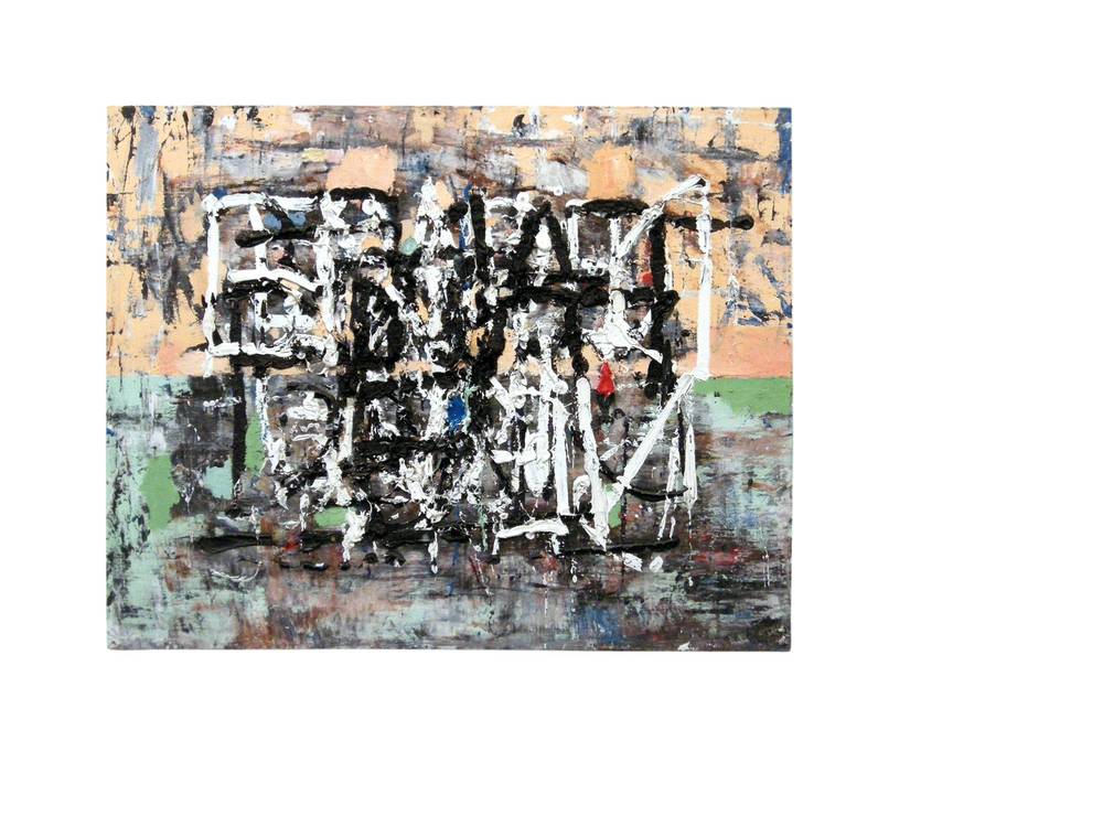
Take, for example, one of the standouts: Mark Dutcher’s “Sunnylands, Ex. Exit” canvas. With its thick oil and gesso impasto, “Sunnylands” refuses to behave: The terrifically textured surface won’t stay flat, the insistent brush strokes won’t chill, the expressionist composition—fleshy on top, Sunnylands green below—can’t decide if it is word or image. Black and white words clobber, smother and obscure each other in a doomed bid to win a messy argument. The “Ex” and “exit,” with their apparent allusion to break-up, are easy to make out; the rest is a stunning Rorschach of raw emotion.
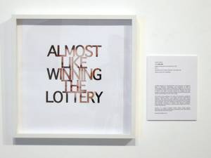 Lauren Adkins’ “1/1,000,000,” part of Sampler: Las Vegas.
At the other end of the spectrum is Lauren Adkins’ slick and clean digital collage. In “1/1,000,000,000,” words dominate the image in a dictatorial takeover of the picture plane. Adkins’ conceptual critique of pop culture features a capitalized sentence, “ALMOST LIKE WINNING THE LOTTERY,” dressed in a corporate typeface, very sober and crisp. And who’s peeking through? Why, it’s Leonardo DiCaprio! His stenciled portrait has just enough detail for the mind to fill in the missing bits. But you have to look “past” the text to glimpse the one-in-a-million icon and questionable promise of celebrity bliss.
Robert Beckmann’s “Tactic” also uses stenciled letters, this time to a more philosophical end, somewhere between being and nothingness. Appropriating the braille version of the “American Soccer Association Annual Report” (1976), Beckmann punched the word “Tactic” into its craft-paper pages—an empty stencil on one side, the confident word “TACTIC” printed over the braille on the other. Between the empty and full “tactic” looms the missing “tactile” in all its sensory resonance. The phantom “tactile” inhabits a curious middle ground, somewhere between sight and blindness, between analyzing an artwork and feeling it.
With intriguing pieces by David Ryan, Brian Zimmerman, JK Russ and other local, regional and international artists, Sampler offers the image/text range promised by its cross-stitched title. Overall, it suggests that text-based work continues to shift away from the clarity of Pop art captions and consumer commentaries in the last century, toward more ambiguous, even incomprehensible, observations in this one.


